The advert that I have created is for a perfume called ‘Neon!’ by a company called ‘Kryptonite’. I decided to design this advert to target a younger audience ranging between the ages 14 and 28. As the advert is not the typical ‘glam’ advert with the pretty female oozing sex appeal I feel that it is aiming to people that are not in the general mainstream, it’s targeting people that aim to be different and stand out from the crowd which in a model of audience segmentation would be classed as the ‘individuals’.

I think the cold black, white and blue colour scheme along with the shadowy look on the girls face creates a sense of mystery therefore implying that if the consumer buys this product it will give them a mysterious air about them, also I think the facial expression especially has a sexy and confident stare which may also indicate that following the purchase of this product the buyer will gain sex appeal and confidence.
I chose the names of the product and brand with intention, not just because it fit the picture. I chose ‘kryptonite’ as the brand name as it refers to Superman, maybe connoting that the buyer of this brand will have a certain power that they didn’t have before, not a super power such as being able to fly but a new found confidence and/or a more powerful effect on the opposite sex, this also links in with my next point. As kryptonite is Superman’s weakness it may connote that buying from this brand will make the buyer irresistible, as they are the opposite sex’s kryptonite, they have the power to make anybody fall at their feet.
I chose the name of the product to be ‘Neon!’ as neon is a strong, bright form of colour, it doesn’t blend in, therefore it will make the consumer of this product stand out from the crowd and catch other people’s eye. I worked my advert around this, not the other way around.
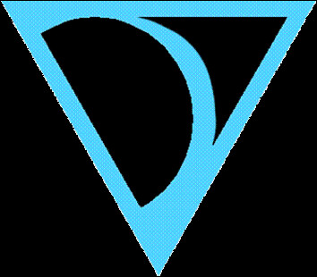
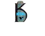
With the brand logo I chose an upside down triangle, the same shape as Superman’s logo as it
 will help the audience establish the link between this product and Superman. There was no particular reason for the pattern on the logo, I stumbled across a website the night of designing the advert and found inspiration from this clothing website called ‘Kathmandu’.
 I made the logo from scratch using photoshop, it started off as a 2 dimensional shape, but by using Photoshop CS3's liquify tool i could use the 'bloat', 'pucker', and 'tweak' tools along with 'smart filters' and other blending options to make the logo look professional and 3 dimensional.
 Original
 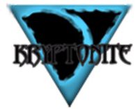 Photoshopped
For the bulk of the advert which is the picture of the girl I chose to use an eye-level close up
 and then I cropped it so only half the face was visible, I did this as I feel it adds to the mysterious effect, with only half the face being on show and none of the body it leaves the audience to imagine about their ideal complete version, it creates a sense of mystery, as if there is more to find out, maybe if they buy the product they’ll find out…
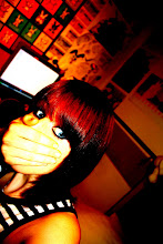
 <--- This is the original picture i used. I made it the vivid chiaroscurro black and white by altering the RGB in black and white.
As well as creating a sense of mystery I think having a close up that is eye-level allows the audience to see the detail in the expression of the face – mainly the eye as there is not many other visible features on the face to create expression - which is why having a close-up is so important as it focuses on the eye which I think is one of the focal points of the advert.
I have used the eye as a focal point because all eyes are beautiful and it gives the audience a chance to see the simple beauty of the eye and the complex emotion created by it. The emotion would be interpreted differently by different people in the way they want to see it.
Also, by not showing many features of the girl the advert is not offending anyone or putting them down for instance if there was an advert of a beautiful skinny girl advertising this perfume it may put the curvy women off as they feel this perfume isn’t going to do anything for them because there is no way they can be anything like that. So the beauty of an eye is something anyone can relate to and think “yeah, I can be like that”, therefore the eye gives hope and opportunity for anyone which means that ultimately it will appeal to a wider audience.
With representation i think my advert represents the younger females like i said at the beginning, also as i was saying when i was explaining the importance of the eye i think this advert represents women that aren't all gorgeous and skinny but can still be mysterious ans sexy by the use of not showing off, or drawing attention to the body or any facial features other than the eye.
With the aid of photoshop i did alot of editing to the eye to make it look more 'crisp' and 'clean'. I have a picture here of the eye before and after
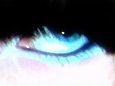 Before
 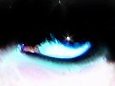 After
AfterI think the picture after edit looks alot more professional and is more to look at. With the starry sparkle in the eye, the darker richer blue in the iris, the whiter eye and the thicker, more even eyelashes the eye looks more beautiful and more of a focal point. To me, it also looks more magical and creates a feeling of wonder and hope.
The bottle was another item i made from scratch using photoshop. I simply used a K in my desired font as the outline for the shape of the bottle; i then worked around that using tools such as the brush tool, the smudge tool, the burn tool, and the eyedropper and paintbucket tools. I then played around with the blending options until the bottle looked like an actual bottle, it was time consuming and took alot of trial and error, especially as i have never used photoshop before, but i eventually got the look i desired.
 I then copied the logo and the Neon! sign and shrunk them to fit on the bottle.
With the neon! text, (and also the Kryptonite writing and the K for the bottle) i found a website on the internet that was a text generator and had lots of different fonts for me to choose from, the website was http://www.textspace.net/ I chose my desired font and typed in the word and generated the text, i then print screened this and copied it on to photoshop. By using selection tools and layering i managed to pick out the word from the print screened picture with no white background, this was very time consuming and fiddly and probably the hardest thing for me to do on photoshop, but it was worth it as the website had better fonts than photoshop. I spent alot of time zoomed in around 600% erasing tiny squares and filling others in with the brush tool until the text looked neat. As the text was a picture all along i didn't have to convert it to a smart object like i would have to with normal text on photoshop, but i used the blending options again to make the picture look more 3-D and have shadows and depth. I also changed the opacity to 75% so that it was slightly translucent, it gave a good effect and reflected a neon type style with the bright blue against black.
I finally had the chance to start putting the whole thing together, i had in the end 20 layers and 2 pieces of text ( 'from' and 'parfum' which i played with using blending options to make them stand out more), but after spending hours working on photoshop CS3 through trial and error i managed to find it quite simple and the large amount of layers didn't phase me. I made the final picture look more professional by adding the shadows of the bottle and the logo, by doing this i copied the layers and changed the opacity to around 30% and moved the layers beneath the original layer so that they were behind it. I also used a star shaped brush tool to add neon effects to the background. I finally used the brush tool to add sparkle effects like to that of the bottle cap and used the smudge tool to touch up anywhere that was necessary and wallah! :)

My final piece has changed slightly from my original design, but when i put the logo, bottle and name at the bottom it looked too cluttered so i changed a few things but tried to keep it as similar as possible. I tried to maintain the rule of thirds, having the logo on the left, the eye towards the centre and the bottle and name on the right.
3 comments:
ta xD
Amy,
I second this praise from Mr Seal - you show a high level of technical skill combined with an astute sense of the connotations of the piece (as developed with the Superman style logo).
Keep up the good work!
This is a very striking advertisement and I liked your comments about how you chose to represent the woman - especially how you enhanced the eye and how this then became the focus of aspiration - appealing positively to the audience. Great piece of work. mw
Post a Comment